Legacy Update:

This is Roland Wright, fighting hard for our country. His story is the one that I’ll be sharing, and he is such an incredible person. I contacted the videographer from LDSTech who shot the mormon message for the Mormon Mustang (Wright’s plane) to see if I can use some of the footage he took of the plane in flight.
 

My video is going to be a lot different, specifically because in my story I want to emphasize how stories like this need to be preserved and remembered.
This week, I have been sketching out shots and creating a shot list, coming up with a list of interviewer questions, and striving to make this preproduction the best that I can. I lost a couple SD cards this week with some of the footage that I took, so I’ve been conducting new interviews and looking for that. It’s been a stressful week, but next week I’ll be shooting everything else that I need. The Flight Museum is giving me access to archive footage as well as footage they’ve taken when they were in flight. I’m excited to see how it all turns out!
I am shooting b-roll and an interview this Monday with the Flight Museum as well. It’ll be great!

Flight Museum: Leaving a Legacy

The past couple of weeks have been filled with with lots of preproduction. I am going tobe shooting a documentary about Ronald Wright, a WWII aviator who shot down three German fighter planes in his infamous mormon mustang. It turns out that as of late, his health has been failing him. The veterans at the Legacy Flight Museum were dedicated to sharing his story, and I complied. I’ll be sharing his story, and emphasize that these stories are an important part of Idaho’s history, and need to be told.

I will be shooting b-roll of the planes in flight, the men talking about and taking care of the planes, and old footage from archives that the flight museum has in stock. I am excited to showcase the final product!

Here is some footage from one of the many shoots I did this week!

IMG_1590 IMG_1591

Vector Icons: Autumn Fallin’

Learning Vectors taught me to keep it simple.

I love the shadows, the layers, the texture.
However, as I was informed by a dedicated yoda of mine,
none of those belong in simple vectors.
I thought that with fall always on my mind, it’d be easier to put pen to paper and sketch things out for myself.

20150930_180357 

My sketches ranged from trees, leaves to pumpkins to apples and pears.


I received a lot of feedback this week, after spending several hours by myself over-detailing sunflowers and using crafted strokes and perfecting everything. I brought it into the lab, and the assistant there reminded me that this was not about illustrations- it was about vectors.

simplify1

She worked with me on taking my ideas and simplifying them. I watched anchor points disappear, and I found myself beginning to take the wheel on my own, reusing shapes and mastering the shape builder tool. Anchor points and pretty much anything illustrator related has been a foreign language to me, but now I’m finally beginning to speak a few phrases.

simplify3

After implementing what I had learned, I really began to understand the beauty in simplicity. Shapes became shapes for me, and I didn’t need the contrast of strokes or to use my blob brush as much.

simplify 2

Although I love my style, I know that this will benefit me so much more in the future.

simply4

It was a rewarding process, and I’m excited with how it turned out!

vector icons

This meets the objectives set in here because of the simplicity it has, as well as the creative use of color and soft shaping that makes it uniquely my own. I wanted to create a fall feeling, and I feel the color schemes and sketchy style makes it evident. It fits my intended audience- I wanted it to be Pinterest friendly, for a modernist, hipster young adult group. I tried to mix up my icons and make more unique items that I hadn’t seen online anywhere else. I am really grateful with what I’ve learned. It’s been a great ride.

Infographic: “Meet the Reeses” – A Handmade Wedding Timeline

For my infographic, I’ll be creating a timeline with little tid-bits of information along the way.
I want to do an infographic that tells the story of how Tanner and I met, how our relationship progressed, and the days we’ve been together, little facts like that. I chose this topic as a way to communicate to the public our little story, and we could put it in our invitation. I think it’d be a fun way to create our story, and if I stick with the right graphics, I could later on sell this design as a fill-in-the-blank for brides-to-be.

The idea of telling our story, using black and white photos of us, some cute graphics and rustic design, and keeping it centered towards a very specific audience makes the experience a really rewarding one. Because I’m personally invested, I’m much more excited to spend a great amount of time with this. I also love using photography and white-text to create a sweet style all my own.

I’ll be including the days we’ve spent apart, the hours we’ve spent on roadtrips, the major dates and moments we’ve spent together, and it all leads up to the day we get sealed in the temple. I also think it’d be really cute to create a vector graphic of the Sacramento, California temple.
       Follow Celine’s board infographics on Pinterest.//assets.pinterest.com/js/pinit.js

Here are some ideas that I loved:

I loved the font chose and simplistic, curved, friendly lines used over the photography.

The color schemes and designs here really pop, and I love using the vintage style.

I love the way this story was told. There is a ton on my board that I looked at, and they centered more on graphics. Either way, I love this style and I think I’m going to have a lot of fun with it.

Also, if there’s a worry about whether this will reach an audience, we’re sending out around 450 invitations (we have big families and a lot of loving friends!) so I’ve got a guaranteed audience of that. 😉

Sample Hooks:
“Meet the Reese’s”
“A Brief History of the Future Reese’s”
“Tanner and Celine – how it came to be”

I would love ideas on how to make that cuter. Any suggestions would be great!

October 5- Research the dates, calculate the hours and determine the tidbits of information I’ll be using in my infographic
October 7 – Sketch vectors and graphics that I’ll be using
October 9 – Scan and design in illustrator
October 10 – Create graphics and data, use illustrator programs to perfect them.
October 13 – Gather feedback, refine and go through program
October 15 – Add in extra changes, and begin blog post about it
October 16 – Finalize and finish- it’s done!

I left room here for me to really go over everything. I like to really push myself in the beginning, so I have time to change things when I need it.

Anyways, I’m excited to share our story in this creative way. It’s going to be great!

Creating a Logo, finding an identity.

CelineRachelleLogo1.55

When it comes to branding yourself, there is a lot of thought, and a lot of hours that go into the process. It’s worthwhile, however. Personal branding is an important process- you have to think about what you know, what kind of things that you create, and how you want the world to see you. I loved it.

vintage-mock-up-freebie

This entire scheme began in my Advanced Visual Media class. We were required to brand ourselves for each of the projects that we would be completing during the semester. We were instructed to research our style and crowd-source opinions of others on how they see us. Then, we would start sketching. The idea was to create three complete vectors. They would showcase who we were and make it look complete. They had to be crisp, clean, and unique.
This was quite a challenge, but I thoroughly enjoyed the process.

The first thing that I did was sketch out logos. I learned that I love adding shadow and texture. I’m not much of a minimalist whatsoever. I love making my strokes curved, focusing more on rounded edges and creating a sketchy, comfortable feel. I feel this describes my style of photography and video perfectly. I couldn’t imagine doing anything differently.

After consulting my Pinboard, I began drawing out a LOT of logos.   <a data-pin-do=”embedBoard” href=”https://www.pinterest.com/celinerachelleb/identity/”data-pin-scale-width=”80&#8243; data-pin-scale-height=”200″ data-pin-board-width=”400″>        Follow Celine’s board identity on Pinterest.</a><!– Please call pinit.js only once per page –>//assets.pinterest.com/js/pinit.js

20150922_085440logo

I loved scanning images in and working things out.

wedding

 I loved working with text, turning each edge into something realistic and powerful. I also am getting married in a few months, so I thought about creating logos for that as well.

I had a lot of ups and downs. I had never worked in illustrator before, so it was a whole new world. I put a lot of time into learning about anchor points, shape tools, image tracing, pathfinder, color schemes, and so much more. This week, my computer crashed, so I needed to restart the process after I lost my files. However, I’m glad that I did. Restarting, knowing what I know now, made me create better work.

(I mean, look at the difference a week can make!)

treeslightbackgroundtreehouse

logosnew VectorDraft

I am proud with the difference that this week has made. I love it.

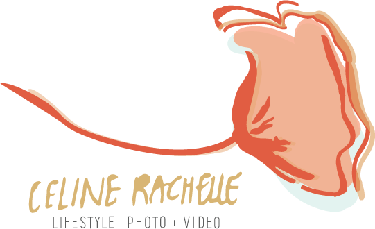
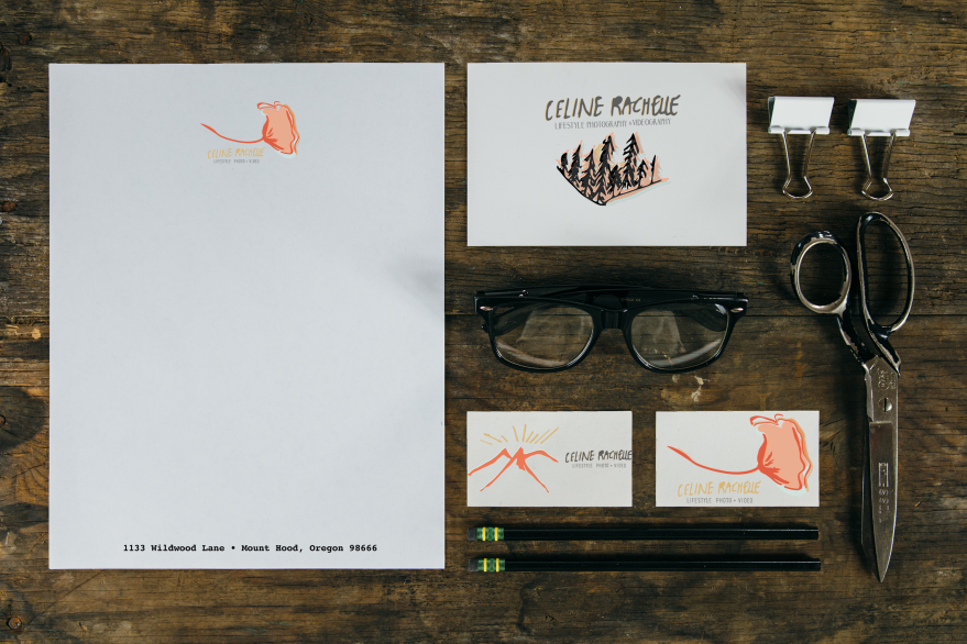
So, let’s talk about the final product! In the image above, I started playing with the text that I drew myself, and I loved it. It was so much fun turning this into a something real.

CelineRachelleLogo1.5

So, I began figuring out which logos I liked the best. That was hard, but I loved these logos the most.

CelineRachelleCollection

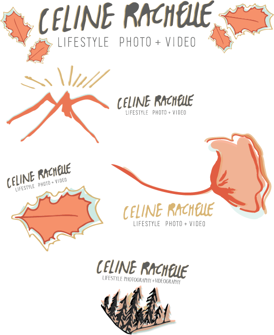
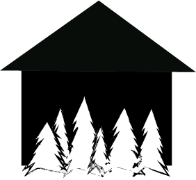
I loved working with the leaves, the mountains, the trees, and the flowers. Each of these are symbols of things that I’m passionate about. I am obsessed with nature. I love capturing the seasons, the changes in life, and I feel that each of these reflect light and symbolize more. I chose the colors of gold, a light blue, a gray, a dark pink, and a light pink. I am a total girly-girl, and gold and blue are light, positive, and I feel like they work well with what I’m going for.

CelineRachelleLogo1.55

Celine Rachelle Logo 3

CelineRachelleLogo2

These three were my favorites, although I really enjoyed the leaves. They were simple, but I know that it was more of an autumn idea, and I wanted something that worked year-round. I layered my colors in order to create a light texture and a lightness to the vector.

The one that I will be using is the flower. I will probably make it a more transparent logo when I post photography, but I love the feminine side of this. I feel it works! I love it.  This was a great experience, and I learned so much about myself from it. It is great to add this to my personal portfolio, and truly understand what I want to do in my life!

Looking at Logos

This week, I got the chance to brainstorm and create tons of sketches.
We needed to create at least thirty different sketches, and I took what I’d been looking at and tried to draw things that I felt captured me.

Here are some of my sketches:

20150922_085440

I love the idea of mountains and pines, because it gives such a natural feel. I love the poppies as well, nature is the best! The shapes that I was thinking of were more diamond shaped or circular. I also thought about using type as a logo, and I think one of my logos will come from that.

20150922_085451

Symbols that I feel I wanted to convey were the pine trees, a house, the wood, and then the image of a streetlight in a snow globe is one of my favorites because it combines some of my favorite things.

20150922_085704

I brainstormed colors that I thought would work, and thought about the idea of using watercolor to showcase the more natural elements as well!

I brainstormed a lot more logos, ranging from sunflowers to nerdy glasses to the curliness of my crazy, tangled hair… and I like the idea of them, but I feel they wouldn’t fit my clients as well as the above drafts would!

I plan on these three options.
1. A house with trees, creating negative space.
2. Using my signature font, channel to make a typography logo
3. Creating a logo with the trees, having light stretch out from the background.

Here is what I’ve got!

treehouse treeslight treeslightbackground

I really want to work this week on creating vectors of pine trees, as well as making my logos look rustic and professional.

My timeline is as follows:

Sep 17 (Thurs) – Sketch 30 logos
Sep 19 (Sat) – Get feedback on sketches – Refine and simplify sketches
Sep 20 (Sunday) Scan and pick a color scheme
Sep 23 (Wed) – Post update
Sep 25 (Friday) – Finalize three sketches, finish typography logo. 
Sep 26 (Sat) – Begin to create vectors of pine trees 
Sep 28 (Mon) – Work on house on illustrator
Sep 29 (Tues) Review, revise, and finalize three logos.

Creating a Logo for a Lifestyle

It’s the beginning of my last semester, and I am so excited to take advanced visual media this semester.
To start off, we’re creating our own personal logos. We need to create three professional vectors, and then pick from those the one that represents who we are.
I love the mountains and all-natural feel of this logo.

This was created by Oh, Pioneer! I absolutely love the feel of their logo. The mountains and treeline give the feeling of something natural and real. I have spent many hours researching what I, myself am all about. I realize that I am driven by lifestyle photography and videography. I love capturing candids, and I feel that this logo can help with describing that.

I created a Pinterest board specifically dedicated to finding my identity, and things that truly inspire me here.

Some other examples I like are displayed here:

As found on http://thinknorth.tumblr.com/

Emma Vallee did a great job here as well. I love the tree feel, and the fact that it looks like a fingerprint. Maybe I could put my initials into the middle. More work can be found here. 

In order to help me realize who I am, I consulted some of my closest friends on Facebook, and asked them to describe who I am.  I asked the public two questions:

1. What are adjectives that describe me and what I stand for?
2. What symbols or images come to mind when you think about my work?

And these were the responses. They ranged from past teachers, to roommates, to family, to best friends, to some people in classes that I had no idea saw me this way!

Here were some comments that I received:

  1. 1. Bubbly, outgoing, smiley, contagious !!
    2. Bright, outdoorsy, sun, love
  2. Sunflowers, Or anchors..
  3. 1) fun, sweet, outgoing, caring, generous, musical, creative, loyal
    2) light, transitions (day to night- you take a lot of photos at twilight/sunset, engagement, mission, graduation- lots of your photos are transitions), music
  4. Innocents and Integrity
  5. Positivism. In love with life. Suns. Sunflowers
  6. 1. Spunky, charismatic, awkward (in a good way), talented.
    2. Cameras, microphones, guitars, curly hair
  7. Sun!
  8. Lighthouse…
  9. Symbol – exclamation point!
  10. Happy, hard working, great employee, willing to help, smart, young, bubbly
  11. 1.Playful, determined, bubbly
    2.composed, pristine, detailed
  12. Sunshine!
  13. Gorgeous talented brave optimistic
  14. 1. Creative, smiling, English/writing. You should do a camera lens or tripod or books.
  15. Kind hearted, maternal, energetic
    Smiles, cameras, ocean
  16. Outgoing! Happy or something happier than happy! Positive!
  17. Light

You could say it was a pretty optimistic questionnaire. But it gave me a lot of ideas. A lot of people mentioned words like “sun”, “light”, “happiness” “bubbly”, and “creative”. I think I definitely need something that makes people feel warm, comfortable, and happy when they see it. I think that incorporating light is a big deal. Now to figure out how to do it. Good thing I bought a sketchbook for this exact purpose.

I know that companies, families, and clients will be hiring me for my lifestyle form. I am currently working for a great company, Netmark, that strives to help companies that enrich lives get found on the internet through promotional seo and positive content. I know that companies like that will be more entrepreneurial, more modern and technical, a little hipster, and passionate about what they do. I know that I still need a sense of professionalism and credibility with my logo as well.

My timeline for this project looks like this:

Friday: Sketch up some drafts and ideas.
Saturday: Modify some ideas and pick six designs that really stick. Then I want to reform them and try to make them the best possible.
Monday: I want to narrow it down to three designs.
Tuesday: I plan on consulting with my professor about what could be improved, and then reform them. In class that day, I’m excited to learn how to vectorize my sketches.
Wednesday and Thursday: After finalizing my sketches, I will scan them.
Friday: I will edit and work on designing them in Indesign.
Monday: I will show them to my professor and make sure it looks up to standard.
Tuesday: I will finalize everything and prepare my blog post, refine it to the best I can and choose which one I like the most.

My goal is to give myself a little more time to get things done so I can make adjustments if necessary!

I’m looking forward to showing you what I’m creating. I’ll show you the process in the next couple of weeks.

Photography Contests

Lately, I’ve been playing with some of that golden lighting. I wanted to submit some of my photography into some contests!

I submitted some of my photography to the “Nature’s Best Photography” Flickr contest. It was beautiful seeing all of the other submissions.

https://www.flickr.com/groups/naturesbestphoto/

This is what I submitted:

fields

This photo was shot at the Sand Dunes in Saint Anthony, Idaho.
1/320 sec;   f/6.3;   ISO 100
It was 8:35pm, and I this lens flare was PERFECT!

For the Traveler Photography Contest for National Geographic, I submitted this one:
I call it “Exodus”
1/500 sec;   f/5.6;   ISO 100
Taken at the Sand Dunes at 8pm at Saint Anthony, Idaho

desert

For this one: https://photocontest.cgap.org/cgap

I submitted this!

IMG_9781

1/4000 sec;   f/6.3;   ISO 100
Taken at the BYU Idaho Track at 7:30pm on June 2, 2014
I chose this one because in the industry there are so many challenges that we have to face. This poem says “When we are cast down, rise up and walk again” and it has helped me so much in my life. We have to face so many hurtles in our lives!


How to create a Polar Panorama

Polar Panoramas are great to show a 360 degree view, in a creative way. They’re great for printing . Panoramas look great this way, and it’s really simple to make, with some stunning results! I wanted to create this after seeing some great examples on this great website, and wanted to try it out for myself.

Here’s a jpeg of the PDF I made for a tutorial!

PolarPanosCelineWhite

The photos I used were all taken on May 20th, 2014. I took them at Beaver Dick (a Camping ground) and at the LDS Rexburg Temple.
I talk all about them in my raw-edits article!

To download PDF, just click here: PolarPanosCelineWhite

I also made a youtube tutorial of how to do a Polar Panorama, which I have embedded here:

tree panorama